
Ivy Invest
Redesigned the experience to help first time users quickly assess fit and move forward with confidence, leading all 5 participants in usability testing to complete sign up and enter the investment flow.

Redesigning onboarding to build trust and drive first investment intent
First time Ivy Invest users were signing up, but not continuing into the investment flow. I redesigned the experience to help users quickly understand the product, assess fit, and feel confident enough to take the first step.
ROLE
Product Designer
INDUSTRY
FinTech and Investment Management
TEAM
Product Manager, Engineers, Investment Officer
RESPONSIBILITIES
Product Design, User flow, Prototyping, AI Prototyping, Iteration, Content Design
TIMELINE
Jan 2026- March 2026
Business Need: First Investment Conversion
Increase the number of qualified users who move from sign up to first investment by building trust and reducing hesitation during onboarding.
Design Goal: Build Trust and Clarity
Enable first time investors to quickly understand the product, see if it is right for them, and confidently start investing.
CHALLENGE
How might we help first time Ivy Invest users quickly determine whether the product fits their needs and feel confident enough to begin investing?
Before

After
It shifted from a bare verification screen to a guided onboarding experience that introduced the product, surfaced trust signals, and gave users enough context to continue with confidence.
RESEARCH AND PROBLEM REFRAMING
Research Goal
Understand why first time Ivy Invest users dropped off after sign up and what they needed to move forward.

The onboarding collected user information, but did not build enough clarity, trust, or momentum to continue.
Because direct access to users was limited, I triangulated stakeholder input, competitive patterns, and gaps in the current experience to identify where onboarding was falling short.
Stakeholder Insight
The PM identified a clear business signal: users signed up, explored the product once, and did not return.
Product Audit
The onboarding worked like a basic account setup flow, but did little to help users understand product fit, build trust, or feel ready to invest.
Competitive Analysis
I then studied how other investment platforms introduced complex offerings and reinforced credibility during early decision making.
User Profile

Key insight
Users did not need basic investing education. They needed enough clarity, trust, and decision support to determine whether Ivy Invest was right for them.
User Journey Map
Rather than treating onboarding as account setup, I redesigned it around the questions users needed answered before they were willing to invest.

IDEATION
Why I Chose Option C
Option C created the strongest balance between usability and trust building. It kept the onboarding flow simple while making product context and credibility visible when users needed them most.
Option A: Embedded Content Layout

Too much information inside the form
Clearer context, but the flow felt heavier and more cognitively demanding.
Option B: Secondary Support Layout

Cleaner layout, weaker reassurance
Supporting content was easier to ignore, which made trust building less effective.
Option C: Persistent Context Layout

Best balance of clarity and progress
Separated action from reassurance, so users could move forward without losing context.
HIFI DESIGN
To accelerate exploration and early validation, I used Claude Code and Replit to prototype layout ideas, compare interaction patterns, and quickly iterate on high fidelity concepts with the team.
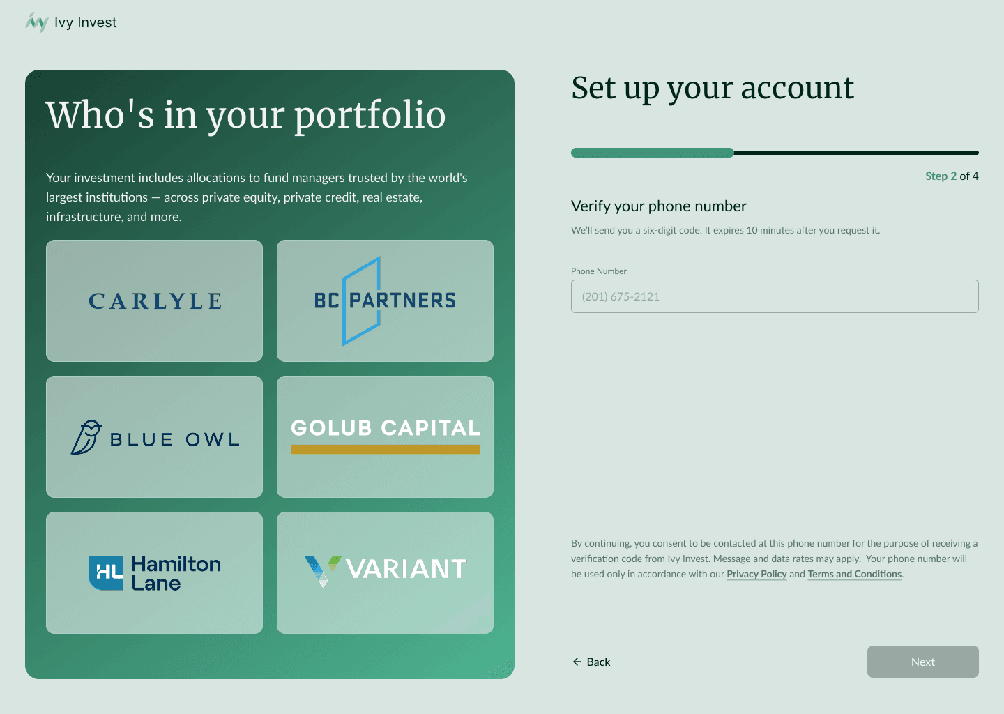
Made trust visible during account setup
I paired account setup with portfolio context and recognizable partners so users could evaluate credibility while continuing through the flow.
Build human credibility early
Added a recognizable human presence early in the flow to make the product feel more credible and reduce initial skepticism.

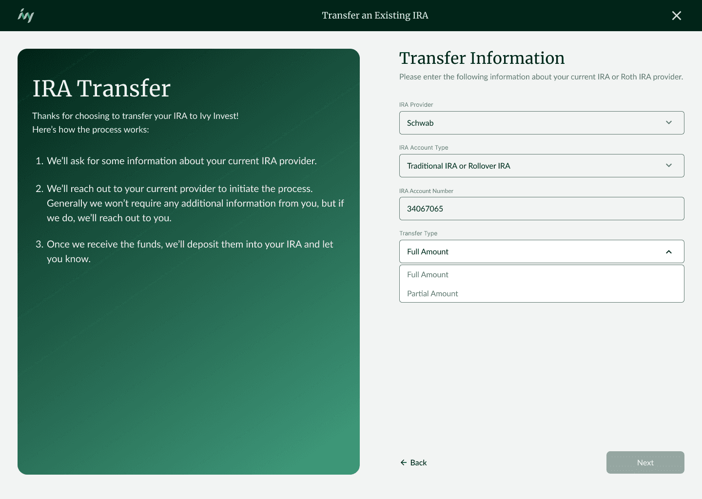
Make the first investment step feel manageable
Made the first investment action feel more manageable by breaking a high friction process into clear, guided steps.
TESTING AND ITERATION
I conducted usability testing with 5 participants to evaluate whether the redesigned onboarding improved both comprehension and willingness to continue. When users reached the investment options, many hesitated, dropped off, or felt unsure about how to proceed, so I iterated this part of the experience.
Added Help Me Choose
I introduced lightweight guidance to help users who understood the product but were still unsure how to begin. This reduced decision paralysis and gave users a clearer path from interest to action.
Data I would track after launch
Although the product has not launched yet, I would evaluate the redesign through a metric set rather than a single number. The primary signal would be conversion from onboarding completion to first investment initiation, supported by drop off by step, interaction with decision support features, and time to first action. This would help the team understand both whether the experience drives business value and where to iterate next.
Retro
Reframing the Problem
I learned that the core issue was not onboarding friction alone, but whether users had enough clarity and trust to move forward. Reframing the challenge at that level led to stronger design decisions and a more business relevant outcome.
Cross Functional Collaboration
This project highlighted the value of close collaboration with cross functional partners. Aligning product goals, financial domain knowledge, and user concerns was essential to turning a complex investment flow into something clearer, more credible, and easier to act on.
Moving Fast in a Startup
As a startup designer, I learned how important it is to move fast without losing the bigger picture. This meant framing the right problem early, making focused trade offs, and using collaboration to turn limited inputs into a strong enough point of view for design.
Checkout my other projects

